UKG Modern Experience Vision
The ProjecT
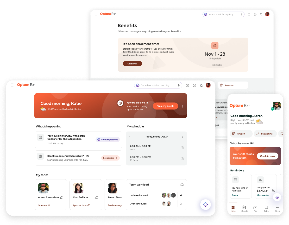
I led and delivered the strategic product creative vision that set the direction for elevating UKG’s experiences to be AI-driven and consumer-quality
One of the company’s largest design initiatives in years, this high-profile, high-impact project is for one of five strategic priorities set by the new executive team: to deliver modern experiences with a new UX across the product suite.
Outcomes snapshot
70%+ adoption
in Q4 beta
Highlighted at UKG’s
5,000+ attendee
customer conference
Instrumental in closing a recent $1.1M full-suite deal
Cited in UKG’s improved Forrester Wave position in Q4 2025
The Problem (DIscover & Define)
Research highlights from customer interviews revealed that customer – especially managers and administrators, want simplified workflows that save them time. In-app feedback from our product analytics tool also revealed that a significant number of customers in all roles thought the product was confusing and were having a hard time finding information.
BEFORE
I analyzed the current experience with the customer feedback in mind, which helped me define 5 focus areas: an outdated visual style, confusing interaction patterns, use of jargon and robotic language, and a lack of content hierarchy.
Inconsistent experiences are also a challenge because the solutions don’t currently operate on a single platform, so this vision needed to help engineering know what to prioritize in terms of connecting the product suite.
The opportunity
MY Process and Role
Design & ideate
I focused on crafting a creative vision that would set the direction for a consumer-quality product suite. I was the principal designer leading the design and ideation, responsible for broad exploration, concept creation, prototyping, and mentoring a new designer supporting the work.
Problem synthesis and expansive creative exploration are core strengths of mine, so this part of the project was especially rewarding.
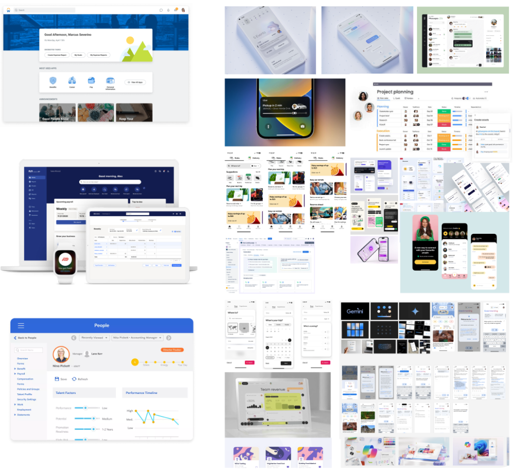
Competitive analysis & consumer-app research observations
Plain language, refined typography, clear content hierarchy, generous spacing, uncrowded layouts, seamlessly integrated AI functionality
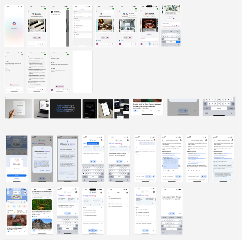
Consumer app AI research
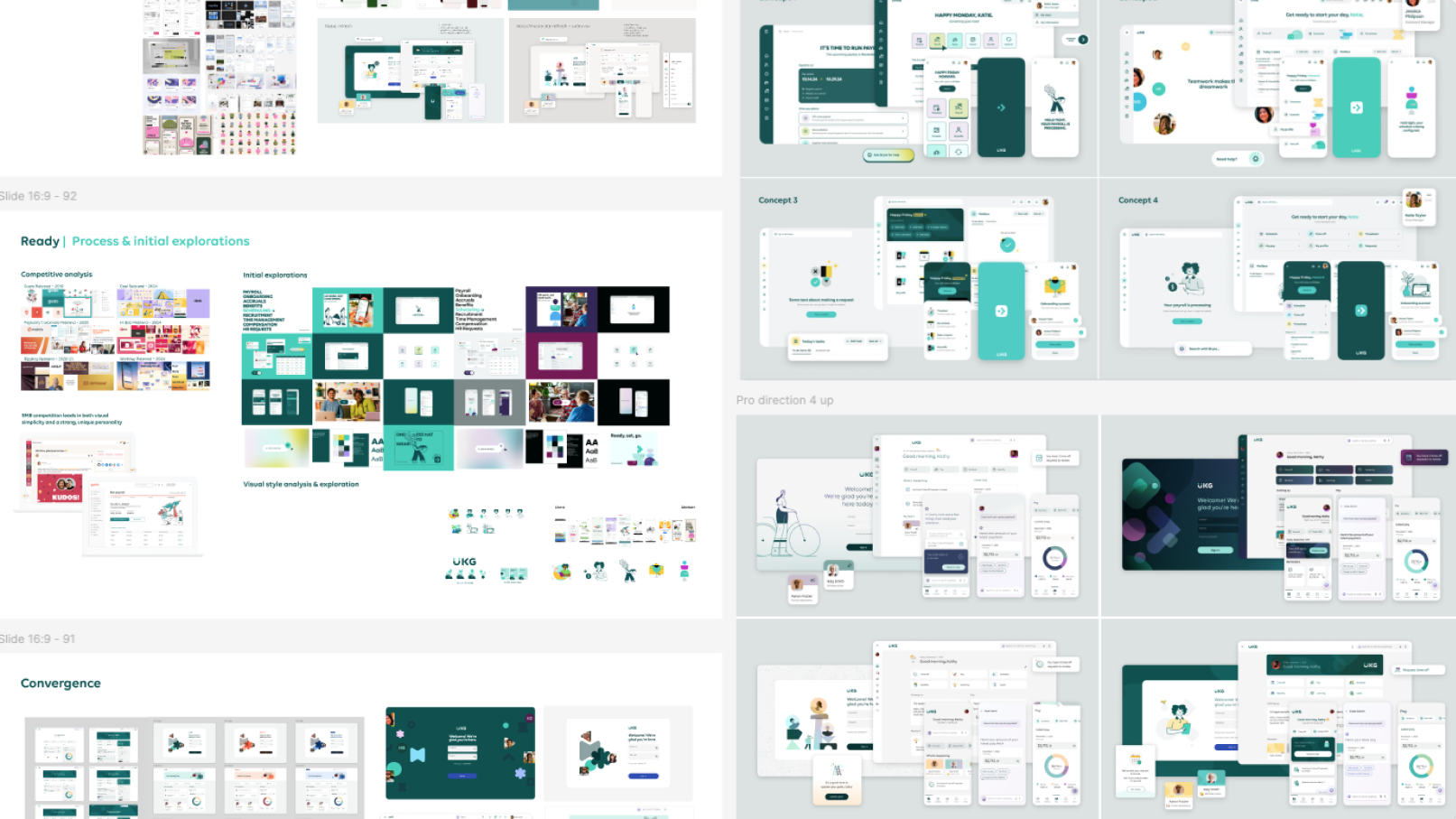
Design exploration & initial concepts
Design principles for a unified product family
Seamlessly integrated AI
Shared foundational design system
Plain language
Flexible expressive elements
Intentional customer branding
Enable future motion design
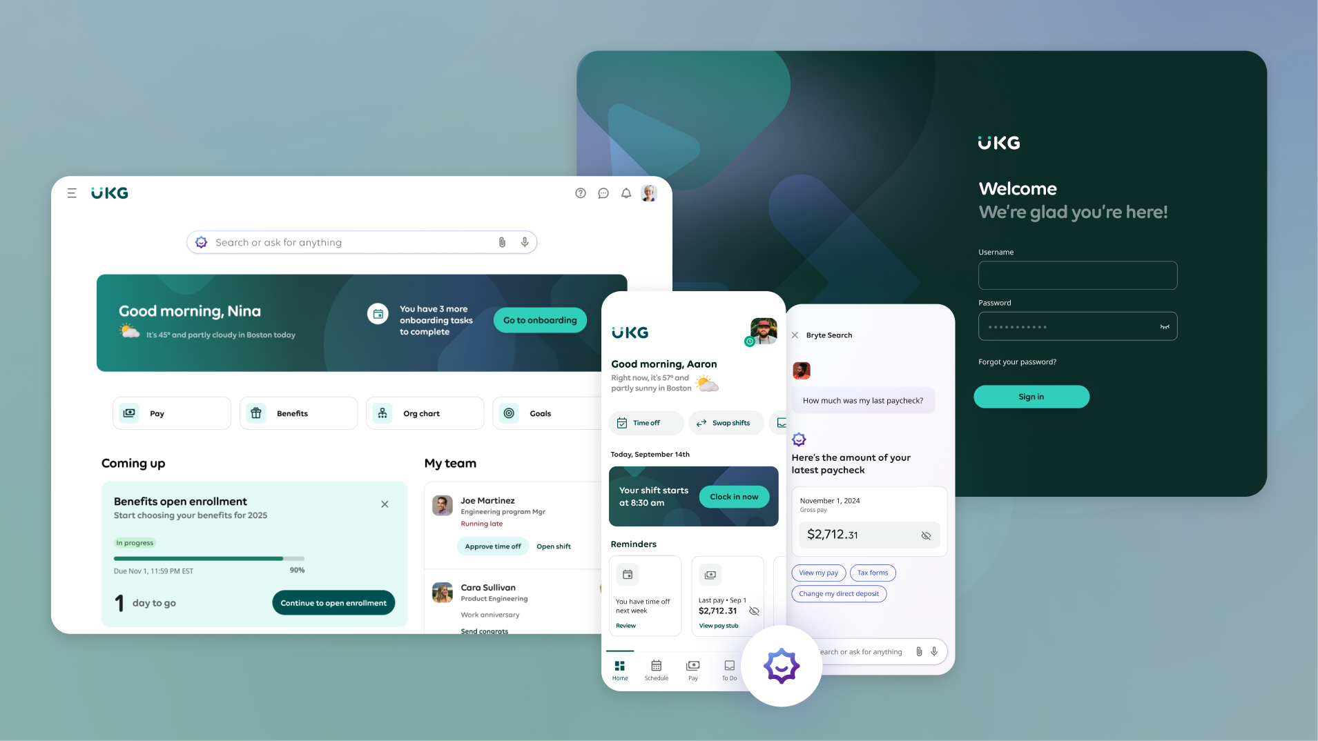
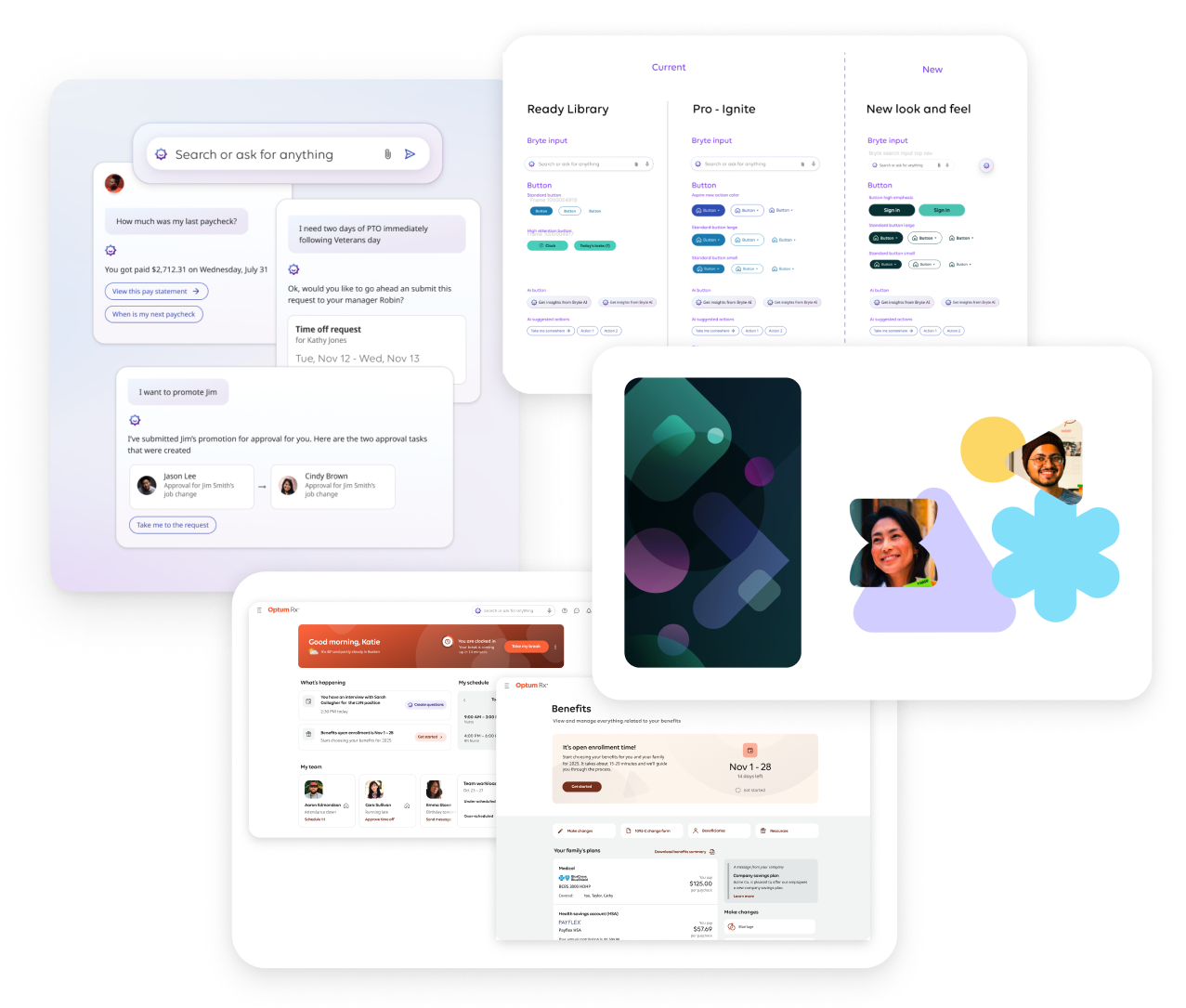
Modern experience vision
Modern experience vision in action
Test & Iterate
Once the new creative direction was set, I worked with a larger cross-functional team to validate and scale the vision.
In this phase I was a co-lead, advisor, and contributor – first, working closely with the design system lead to translate the creative direction to update component styles, define new page patterns, and review with the accessibility team.
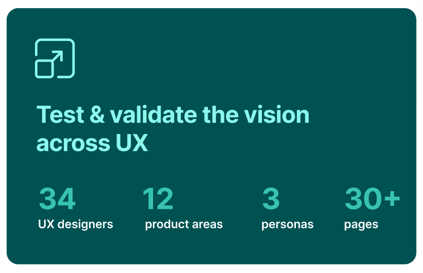
Once the design system was updated with the new vision, I led 3 other designers to apply and stress test the vision across over 30 product pages for our 3 different personas.
Build & implement
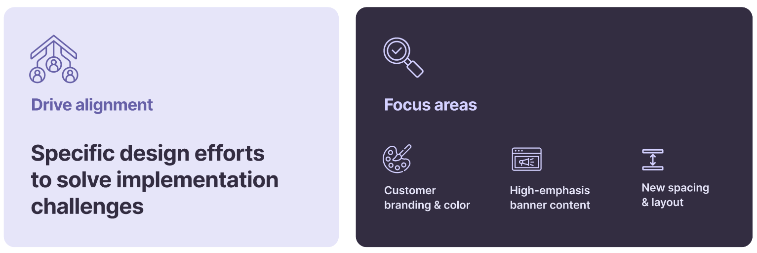
As we got into implementation for the upcoming beta release, specific challenges and questions came up around how to build the vision – which was to be expected.
To help answer those questions, I led design efforts as needed to help clarify the design strategy in specific areas for engineering and product leaders.
Customer branding & color configuration
Over 90% of customers configure the product to represent their own brand color.
However, the current experience allows for different configurability across different product areas which contributes to inconsistent experiences.
For the vision to succeed, customers need to see themselves reflected in the product. So, I designed a solution for customer branding that balances personalization with a consistent, high-quality experience.
For the new color theming strategy, I’m working closely with the design system lead who’s figuring out the logic to support full customer brand configuration.
This will allow customers to choose from a set of dynamic, accessible UI color options, generated by simply entering their primary brand color.
Since the full branding capabilities were out of scope for beta, I worked with UX, product and engineering stakeholders to create a neutral color interim solution that enabled engineering to set the foundation for the ideal future state.
Dynamic content
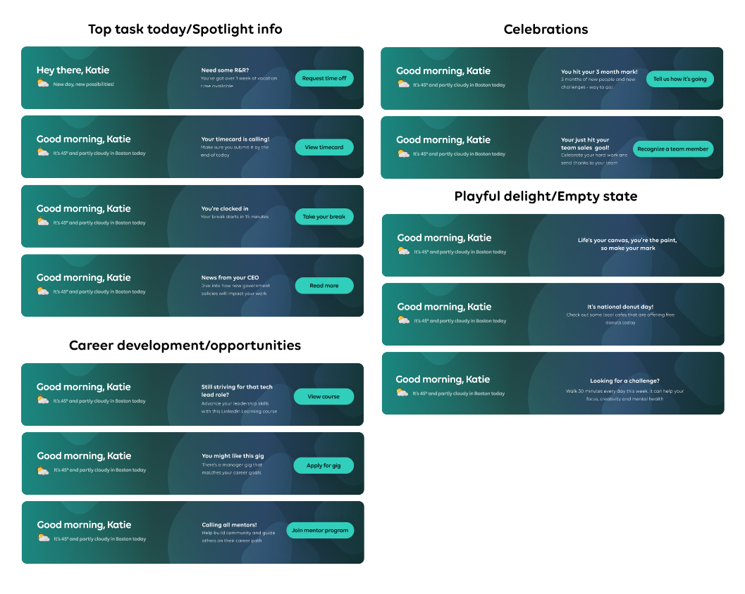
I worked with the content design lead to define the strategy for the high-emphasis home banner
With engineering scope constraints for the upcoming release, we proposed an interim solution that wasn’t dependent on domain team data and instead focused on delight and feasibility.
We recognized early on that a more strategic approach would require clear content requirements based on persona and domain—and we made sure to communicate this to stakeholders to help set expectations around content relevance and avoid redundancy.
New spacing & design styles
Open spacing is a signature part of the vision, giving it that airy, consumer-quality look and feel.
When the VP of Engineering expressed concerns that the new spacing would increase scope for some legacy pages due to platform constraints, I created side-by-side page designs with and without the new spacing specs applied to help demonstrate the difference in quality.
Outcomes
Achieved over 70% adoption among beta customers by Q4 2025, demonstrating strong product-market fit and clear value across frontline and knowledge-worker audiences
Became a flagship experience highlighted across major UKG events, including being showcased at the 5,000+-attendee customer conference as a key pillar of the company's product vision
Directly influenced revenue: in November 2025, a top sales leader credited the Modern Experience with helping close a $1.1M full-suite deal in Q4 by differentiating UKG’s UX against competitors
Contributed to UKG’s improved positioning in the Forrester Wave (Q4 2025), where analysts noted that customers “praised the ease and clarity of the modern UX,” reinforcing the design’s strategic impact at the market level
